B2B2C Ecommerce Platform
Website redesign for a European stationary supplier

About the Project
Since 2000, Charlot Group has been a leading supplier of stationery products to both B2C and B2B customers in the Baltic region. The company started with a small shop in Varu, Estonia, and expanded to more than 50 offline shops across numerous cities in Estonia, Latvia, and Lithuania.
Looking for a Reliable Partner
To strengthen its online presence, Charlot Group decided to revamp their website, as it failed to achieve the expected outcomes. They selected SysGears to identify the reasons for business challenges and develop an improved version of the website.
We started with a comprehensive design audit, which included checking website usability, reviewing its responsiveness and mobile compatibility, analyzing information architecture and navigation, as well as evaluating visual elements.
Business Challenges
Our designers identified Charlot’s main business challenges and their causes. On this basis they planned potential improvements to ensure that the redesign would help the company achieve its goals.
No brand recognition
As a well-known stationary company, Charlot Group has a logo and brand book, but their usage on the website was inconsistent, creating difficulties for the audience to associate the reputable brand with its website.
High bounce rates
The website’s layout and navigation were confusing for visitors, as they lacked structure and visually highlighted categories. Furthermore, the website was not optimized for mobile devices, causing some users to leave immediately.
Low conversion rate
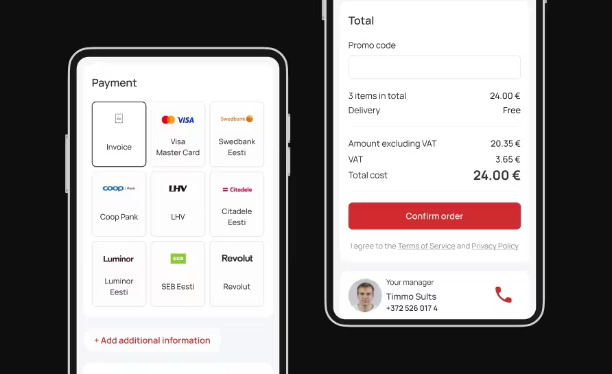
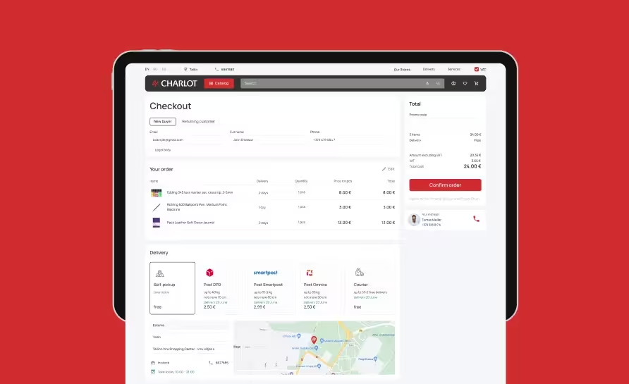
The checkout process was overly complex, the multiple steps and unnecessary form fields distracted users from completing purchases. It also lacked the necessary information about payment and delivery options, which further decreased the conversion rate.
Inefficient B2B workflow
As the website didn’t provide the necessary information for B2B users, such as bulk product availability and price, they had to write emails or make calls to place orders, resulting in counterproductive working process of Charlot’s managers.
No awareness of the company’s services
The services provided by Charlot Group weren’t effectively displayed on the website’s home page, which affected user awareness and demand for these offers.
What We Offered
UX/UI Improvement
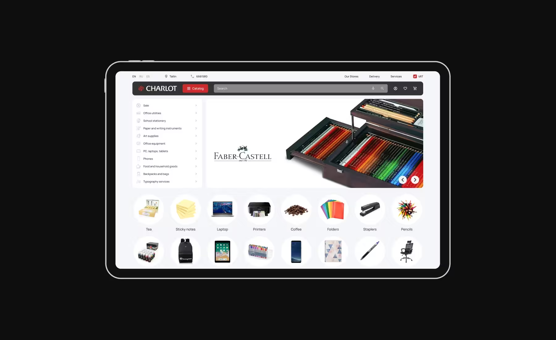
Using the visual hierarchy principles, our experts redesigned the home page and the navigation menu to guide users’ attention by making the product categories more distinctive and , thereby increasing conversions.
Responsive Design
To ensure a seamless experience across different devices and reduce the bounce rate, our team optimized touch interactions and navigation by incorporating media queries and fluid grids for mobile, tablet, and desktop.
Visual Design
Our team concentrated on aligning the website’s images, fonts, and color schemes with Charlot Group’s branding guidelines to create a more consistent and visually appealing look and establish direct associations between the known brand and its website.
Support During Development
We provided Charlot’s developers with detailed design specifications, including color codes, typography, spacing, and layout grids. Our designers also reviewed their work and made recommendations, ensuring the pixel-perfect design.
Solutions
Multicomponent Smart Search System
Our designers created a smart search system with auto-suggestion, predictive search, and filters, including a special price filter with a graphic display that shows the number of products within a specific price range.
In-Store Availability Map
To simplify product search and selection even further, our team added a map that displays product availability and quantity in stores within the user’s selected city. The map also provides the options of faster delivery or picking up from a nearby offline store.
Seamless checkout process
Understanding the importance of a fast check-out process for increasing conversions, our designers reduced the number of steps and implemented the possibility of a one-page guest check-out. Whereas for logged in users, they added the option of using saved payment and delivery methods.
Full-fledged B2B user flow
Our team added separate registration and sign-in options for B2B users, showing them information relevant only to their flow. In addition, our specialists enabled a wholesale option in the product descriptions and made it easy to add it to the shopping cart.
Order Management System
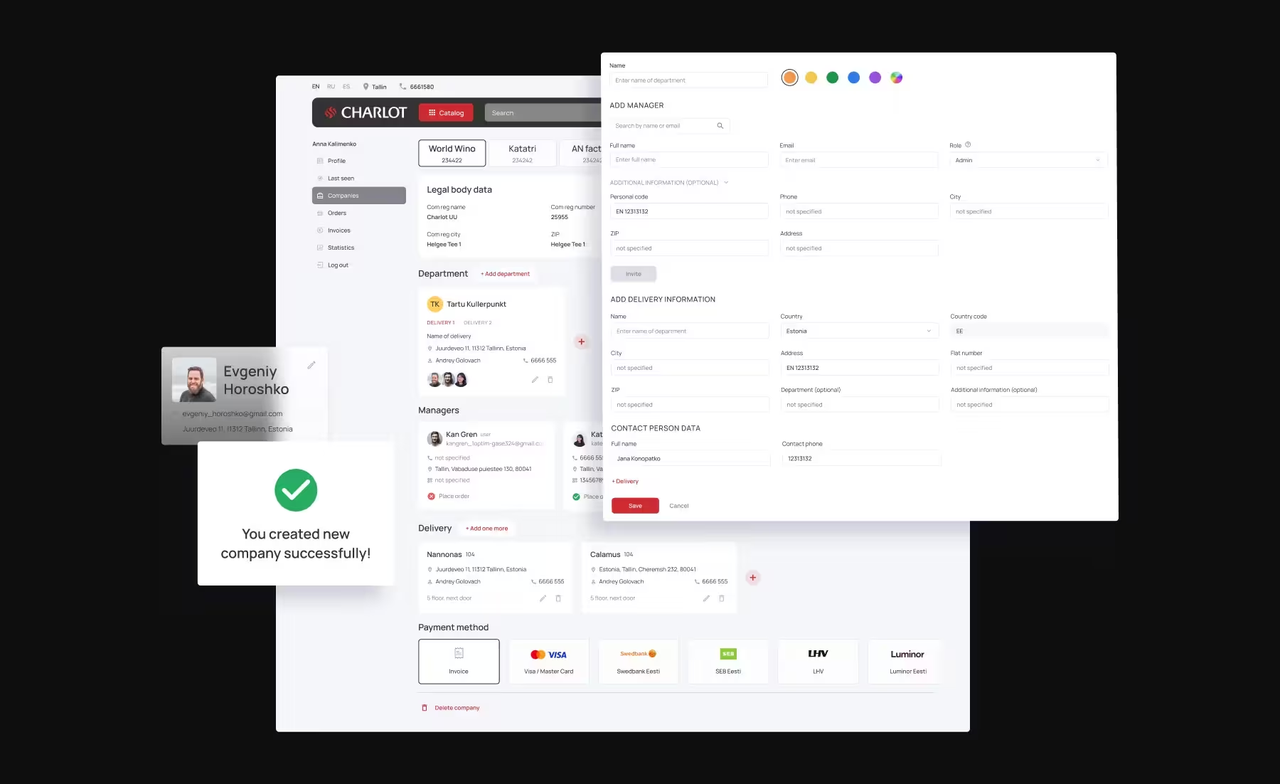
To streamline ordering processes and facilitate approvals, our experts designed a management system that allows Charlot’s administrators to easily manage all invoices and add new companies, including their information, departments, and employees, without numerous calls, emails, and clarifications.
Streamlined Service Selection and Customization
With the help of our design, users can now effortlessly choose a specific service, such as printing, directly from the homepage and customize their order by selecting settings like size, number of pieces, and paper quality, as well as upload their designs and choose a delivery option.
Boost your business with custom software
Tell us about your business needs and we’ll suggest a solution
Thank you!
We have received your request and will get back to you within 1 business day.